 Diagram One: Lighting set up for Vintage film poster Idea. Low key lighting
I used a black backdrop, a flag, two honeycomb lights and a snoot. I was really pleased with this lighting setup as I think it depicts that 1940's Film Nior look. It creates lots of shadows and sets a particular mood.
 Diagram Two: Lighting set up for mannequin test shoot - High key lighting.
I used two umbrellas, a white backdrop and a reflector. I liked this lighting as it was good if you didn't want shadows, which for this possible idea is the perfect lighting as I want to focus on what you're looking at rather than trying to hide some of the features.
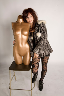 Image 1 Mannequin idea: I really like this idea but didn't know how i could develop it and thought it might be a bit misunderstood and I didn't want to over complicate it.


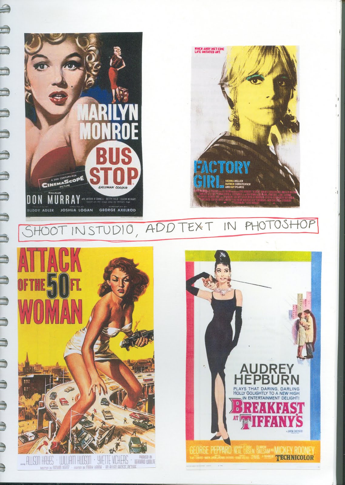
Image 3 & 4 Vintage film poster idea:
 Image 1 Mannequin idea: I really like this idea but didn't know how i could develop it and thought it might be a bit misunderstood and I didn't want to over complicate it.

Image 3 & 4 Vintage film poster idea:
I liked this idea more as I thought i could be more inventive with lighting and film is something I'm really interested in also so thought that would come across more in my images. The only trouble with this idea is that the final outcome could look tacky if i choose the wrong text etc.


