Wednesday, 15 December 2010

Shoot two Georgia back garden mets flash - Digital outcomes

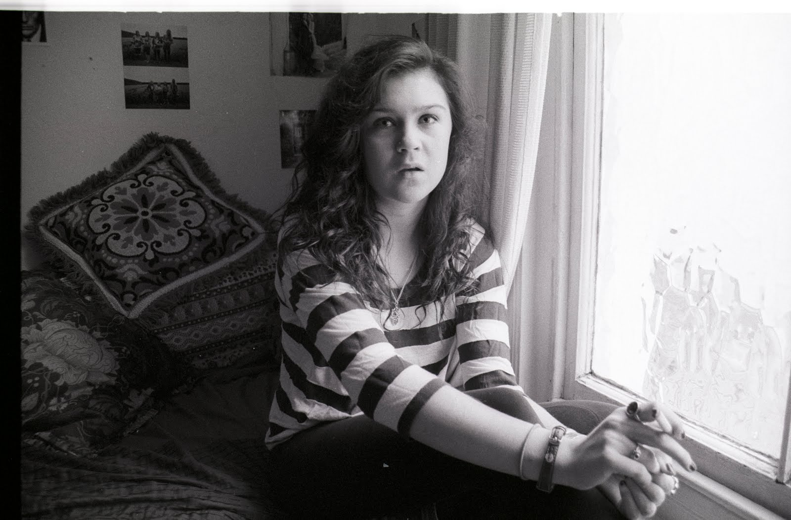
I really enjoyed using the mets flash with digital it made the pictures pop! I did find in comparison to the film shot the white walls look more grey. But this experiment has made me want to use flash more with digital. I found it hard to concentrate when using the attachment so the flash was connected to the camera, so when I took it off i felt more relaxed and at ease as I could experiemnt more with movement of the flash to make the image look more flat or to make the model stand out more.

Shoot two Georgia Back garden mets flash - Film prints


I was really pleased with my film outcomes as I used the mets flash so was worried I wouldn't have set the appertures, shutter speeds correctly. I enjoyed using the mets flash as it was more free to hold it and move it around creating different shadows and highlights.
Suprisingly the coke showed up more in the film shots than the digital shots. The colours are more vibrant and i ended up shooting more of the actions shots with the film slr as I knew I wanted my finals to be in film.

Film prints for shoot one


The colours are much more vibrant in my colour film I feel. the actual shots of Tash spitting arn't as clear and the one i did like of her spitting was a landscape so would have to crop if i used this one as i dont think it would look very consitant of i used a mix of digital and film.

Shoot one - Natasha Churchill Square Car Park DIGITAL POSSIBLE OUTCOME


These are some of my digital prints. These are 2 options of presenting them for finals, i had the idea of either giving the images a white border (but still on the same a3 sheet) or with no white border so they take up the whole page. I thought of presenting them on the same page so they link better but am not sure if it would be better to print one on an a3 page.

I wasn't very pleased with the digital prints, I'm not a big fan of digital and i found it hard to work with these as I prefer the grain and colour of film.
I also shot a roll of film for this shoot.

Ideas


I came up with my idea before I saw Erwin Wurm's work about things you shouldn't do in public (the particular picture i was inspired by was the one of the woman spitting in her coffee) but when I was shown it it linked perfectly.
I had the idea do to three different girls portraits, I wanted them to look almost "fashiony" and the girls to look done up. Then alongside their portraits I want to have a portrait of them spitting drinks, shouting, screaming etc. The more I thought about the idea I remembered a photo by Elaine Constantine, a portrait of singer Roisin Murphy, where shes standing fully clothed in the sea with two pints in her hands and she is screaming, hair flying everywhere and beer coming out the glasses. I was already a fan of Elaine's work and the more I looked at it the more I was inspired to do this idea. Elaine's work is playful, colourful and bright without being cheesey. She's shot alot of girls running around and acting up almost as if Elaine is just documenting friends rather than a staged shoot (which they are)

Monday, 6 December 2010

Artist Research for Colour project

Tim Walker - Tim Walker's excessive use of dramatic props makes his work exciting and almost childlike. The colours are always vibrant and the more you look at his work the more small details you notice that were thoroughly thought through.
Erwin Wurm - Wurms work is ironic and humorous, I think this particular project was a mocking of our society and how everyone is obsessed about the way we should behave and how we are perceived through our actions.
Erwin Wurm
Jeff Wall - I don't think this photo is photographically spectacular but i like the freezing of the mans action and soon as this is something I would like to experiment with this photo is a slight inspiration.
Nikki S Lee - I really like this series, I think its very clever how easily she changes the way she looks and she always looks like she belongs with all these different groups and people.
Nikki S Lee
Hannah Starkey - In Hannah Starkeys work theres always seems to be one prominent colour that dominates the photo. A theme that seems to dominate her work is loneliness and isolation.
Hannah Starkey
Gregory Crewdson - Gregory Crewdson's work always seem to have the same colour scheme theres always very dull bluey greys, but because there's so much planning and technique that goes into the lighting everything pops and stands out in his photos. I like how his work is cinematic.
Gregory Crewdson
Joel Sternfeild - The 2 things that stand out for me in this photo is the pose/expression and the multiple green tones. Everything about the pose draws me in even the flexing of the toes. I think this a documentary photo but i wonder if the positioning is posed or natural.
Stephen Shore - The thing that stands out the most about this photo is the colour of the swimming costume of the woman, I find this photo intriguing because the couple are in an intimate pose but you cant see the woman's face so she looks lost in the embrace but the man is staring straight at the camera so it makes you wonder if its a metaphor for their relationship or if they've been caught in the moment.
Corinne Day - Corinne Day is one of my favourite photographers. I am instantly absorbed into her photos. She makes something beautiful out've something dirty and abit disgusting (which is usually the locations she uses.) I am always inspired by her way of capturing people off guard so that they look more natural and at ease with the photographer. As a viewer you feel like you are looking into their conversation rather than looking at a photograph.
Corinne Day
Corinne Day
Emma Hardy - There is nothing spectacular colour wise about this photo but i like the contrast in the sleeping old woman and the hyper child wearing fangs, i find it humorous. The photo below by the same photographer is the complete opposite as the mellow yellow tones takes over the photograph.
Emma Hardy
William Eggleston - This is the only photo of Egglestons work that i've seen and liked. I think its because even though his use of colour is amazing I find it hard to connect with a photo if it doesn't have people in it, and there is something about the intimacy of the pose and how opposite the poses are to each other that makes me wonder what was going on when this photo was taken.
Beat Steuli - This photograph reminds me of a film still the lighting even though being a flash from far away looks like bright sunlight and it feels as if the man you are drawn is too has just stopped in the middle of a busy new york street because of something hes realised or perhaps read on the piece of paper in his hand.

Bill Henson - Bill Hensons work depicts innocence and vulnerability and his work always confuses me because you cant always tell where the models are and what they are sitting on especially the one where it looks like the girl is floating in mid air. But this slight uneasiness you fell when you look at this series is what I like about his work.
Juergen Teller - Tellers use of flash is what draws me to his work it makes his work look flat but the fact the colours pop out because of it overshadows that flatness. Even the photo below the mains colours are black and white but it feels so colourful because the flash has brought these colours (which people debate whether black and white are colours) to life.
Juergen Teller

Monday, 15 November 2010

Prints for film stills


I chose these 3 images for my final prints for the film stills. I put a black background and text to make them look more like screenshots.

Famous Film Tag Lines

"They're young...they're in love...and they kill people." Bonnie and Clyde 1967


"This is Benjamin. He's a little worried about his future." The Graduate 1967


"No ordinary love story..." Romeo and Juliet 1968


"It's all about women...and their men!" All About Eve 1950


"They had a date with fate in Casablanca." Casablanca 1942


"There NEVER was a woman like Gilda!" Gilda, 1946


"Hunted by men...Sought by WOMEN!" The Third Man, 1949


Film Stills


Image 1: Psycho, 1960 directed by Alfred Hitchcock
Image 2: La Chinoise, 1967 directed by Jean-Luc Godard
Image 3: Gilda, 1946 directed by Charles Vidor
Image 4: Le Petit Soldat, 1963 directed by Jean-Luc Godard
Image 5: Breathless, 1960 directed by Jean-Luc Godard


Sunday, 14 November 2010

Creating the Film poster


When it came to editing my prints to make the final film poster I had a vague idea in my head of what I wanted. At first I had the idea of doing something similar to the "Gilda" poster, I was stuck on a title for my film so focused on the actual photo for inspiration. I came up with the title of "Forever in stripes." I also researched famous film tag lines for inspiration. When I did my first poster it looked like something was missing and a bit pathetic, but I finished it all the same with in mind I would try another version and see what I prefer.

When I did my second version I thought more about the 60s and researched famous 60s films and then looked at their film posters. All of them looked drawn and very colourful, so I used a photoshop technique I learnt in my NCFE digital art class on how to make photos look like an Andy Warhol pop art piece. I chose strong block colours to make it look stronger.


CLICK TO VIEW LARGER

Image 1: Scan from scrapbook of colourful, pop art style film posters
Image 2: Final film poster
Image 3: First attempt at film poster
Image 4:Gilda film poster